

Sweet Bite: Whimsical Snack Packaging Inspired by Childhood Wonder

Tools & Technologies
Adobe Illustrator: Used for creating the vibrant and playful illustrations that form the core of the Sweet Bite brand identity.
Adobe Dimensions: Utilized for 3D modeling and rendering of the packaging designs, ensuring a realistic and professional presentation.
Adobe Photoshop: Employed for refining and enhancing the visual elements, making sure each design is polished and ready for production.
Overview
Sweet Bite is an innovative food design that brings a fresh perspective to the food packaging industry. Inspired by my little sister Adalyn and her love for snacks, Sweet Bite was crafted to capture the attention of young consumers at any grocery store. This vibrant, fun, and enthusiastic cookie brand aims to make people "feel good" when eating it. With bold and eye-catching designs, Sweet Bite is meant to stand out on the shelves and bring joy to its consumers.
Audience
Sweet Bite is designed for young children and their parents, who are looking for fun and engaging snack options. The brand appeals to families who appreciate playful and imaginative designs that can captivate the interest of young ones. Sweet Bite is also aimed at parents who value high-quality and visually appealing packaging that reflects a sense of joy and creativity.
Specialties
Brand Identity: Developing a cohesive and memorable brand identity that resonates with the target audience and stands out in the competitive food packaging market.
Product Packaging Design: Crafting unique and appealing packaging designs that not only attract attention but also communicate the brand's playful and vibrant personality.
Graphic Design: Creating visually compelling graphics that align with the brand's ethos and enhance the overall consumer experience.

The Beginning of Sweet Bite
The concept of Sweet Bite began as an idea inspired by my four-year-old baby sister's vivid imagination. Her whimsical doodles and love for snacks, colors, and creativity ignited my desire to create a snack brand that could resonate with her unique view of the world. The challenge was to translate this vision onto a screen, capturing the essence of a child's boundless creativity.

Research and Inspiration
Inspiration Source:
Sweet Bite's inspiration stemmed from observing my sister's imaginative perspective and her playful doodles. This led to the goal of creating a snack brand that felt as vibrant and whimsical as her creations.
Market Research:
I conducted research on children's snack brands, analyzing their color schemes, packaging designs, and brand narratives. This helped me identify gaps and opportunities to differentiate Sweet Bite.

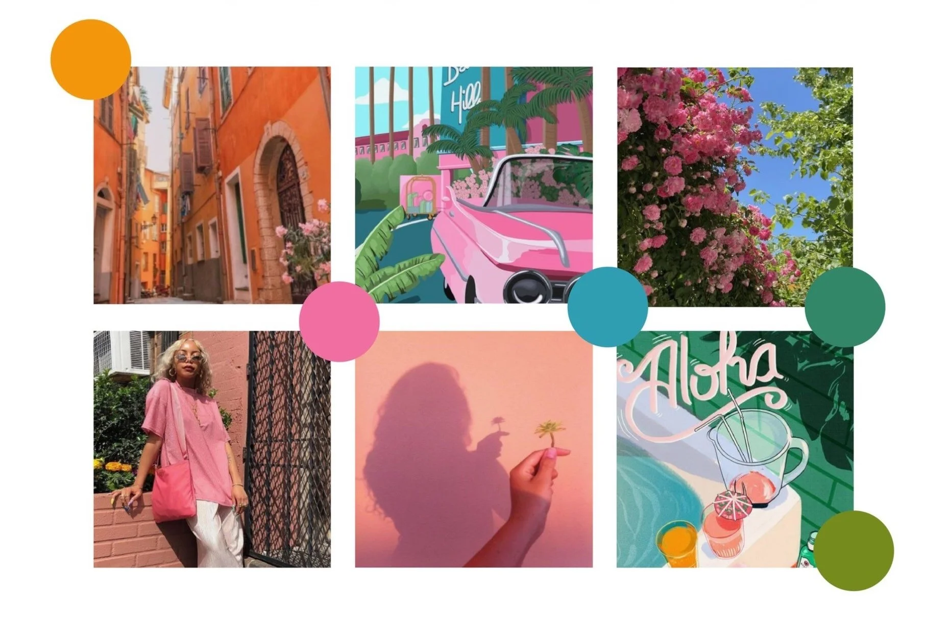
Moodboarding and Concept Development
Moodboarding:
Utilizing Pinterest, I curated a visual collage to serve as a wellspring of inspiration. The aim was to craft a Dr. Seuss-inspired universe, characterized by vibrant colors and playful designs. This moodboard set the tone for the overall brand aesthetic.
Color Palette:
I meticulously selected a palette that felt harmonious yet diverse, reflecting the idea that family members can look different but still feel connected. This conceptual foundation guided the illustration process.

Logo Design and Typography
Font Selection:
Designing the logo posed several challenges, primarily in finding the perfect font. Initially, a Serif style font was considered but ultimately felt too rigid. Shifting to a Sans-serif font, I began modifying it in Adobe Illustrator, incorporating organic design elements and softening the edges to evoke a playful, handcrafted feel.
Logo Development:
The addition of a bite mark to the 'S' breathed life into the logo, enhancing its whimsical nature. To ensure versatility, the logo was adapted into 24 color schemes, serving as secondary logos for various cookie bag flavors.

Illustration and Graphic Elements
-
I established an illustration style that was colorful, fun, and inviting. Each graphic element was categorized into thematic families, aiding in the cohesive creation of the brand's art board layouts.
-
The concept of sorting cookies by fruit flavor and associating them with corresponding colors mirrored how young children link colors with fruits, adding a layer of relatable simplicity to the design.

Product Line Design
Layout Development:
The product line design phase involved integrating illustrated graphics from the ideation stage into color-coordinated categories. Four distinct layouts were developed for Strawberry, Orange, Blueberry, and Matcha flavors.


Prototyping and Mockups
Digital Prototyping:
Upon finalizing the product layouts, the designs were exported as JPG files and applied to mockups in Adobe Dimensions. This step involved adjusting lighting and positioning to enhance the realism of the packaging.

Cohesive Family of Products:
Each design was crafted with the intention of creating a cohesive family of products that exuded fun and nostalgia, reminiscent of a child's imaginative world. The designs aimed to be inviting and playful, encapsulating the essence of childhood creativity.


Influencer Packaging:
Recognizing the growing trend of influencer marketing, I designed typography-focused packaging intended for PR packages. The integration of simple yet vibrant colors with clean typography aimed to evoke a sense of professionalism and excitement.
Conclusion
Drawing from the whimsical world of a child's imagination, the project seamlessly integrated research, moodboarding, ideation, and prototyping to develop a cohesive and vibrant snack brand.
Each phase, from initial sketches to detailed illustrations, and from logo design to product packaging, was carefully crafted to evoke the playful and imaginative spirit that inspired the brand.
Through meticulous design practices and thoughtful application of design principles, Sweet Bite emerged as a brand that not only appeals visually but also resonates emotionally. The innovative use of color, typography, and illustrative elements created a unique identity that stands out in the market. The successful application of these designs in digital mockups and influencer packaging further highlighted the brand's potential to engage and delight customers.
This project not only brought to life a whimsical snack world but also reinforced the importance of seeing the world through the eyes of a child, reminding us of the endless possibilities that creativity can offer.
