


Creatify Web Design Assessment
Client Context
As part of a design assessment for Creatify, I was tasked with showcasing both visual design and UI/UX skills through a two-part challenge: reimagining a YouTube thumbnail and designing a 4-step explainer section for their platform.
✦ Objective
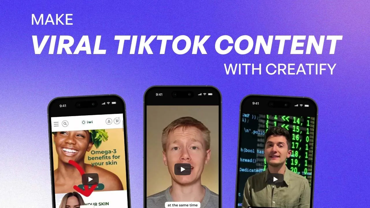
Part 1 – Graphic Design: Redesign a YouTube thumbnail to improve clarity and visual communication of the video’s topic.
Part 2 – UI/Section Design: Create a 4-step visual process section that clearly guides users through Creatify’s workflow in an engaging, structured way.
Visual Clarity: Prioritized readability and instant recognition by simplifying layouts, refining hierarchy, and using strong imagery.
Hierarchy & Flow: Applied consistent typography, bold headlines, and supporting subcopy to structure each step.
Brand Alignment: Selected colors, iconography, and layouts that aligned with Creatify’s tech-forward and creative identity.
User-Centered Thinking: Considered how users would scan and interact with the designs—ensuring they were both informative and visually engaging.
✦ Deliverables
Redesigned YouTube Thumbnail (Feature/Tutorial Video)
Focused on clear messaging, bold typography, and thumbnail imagery that quickly communicates the content value.
4-Step Visual Process Section
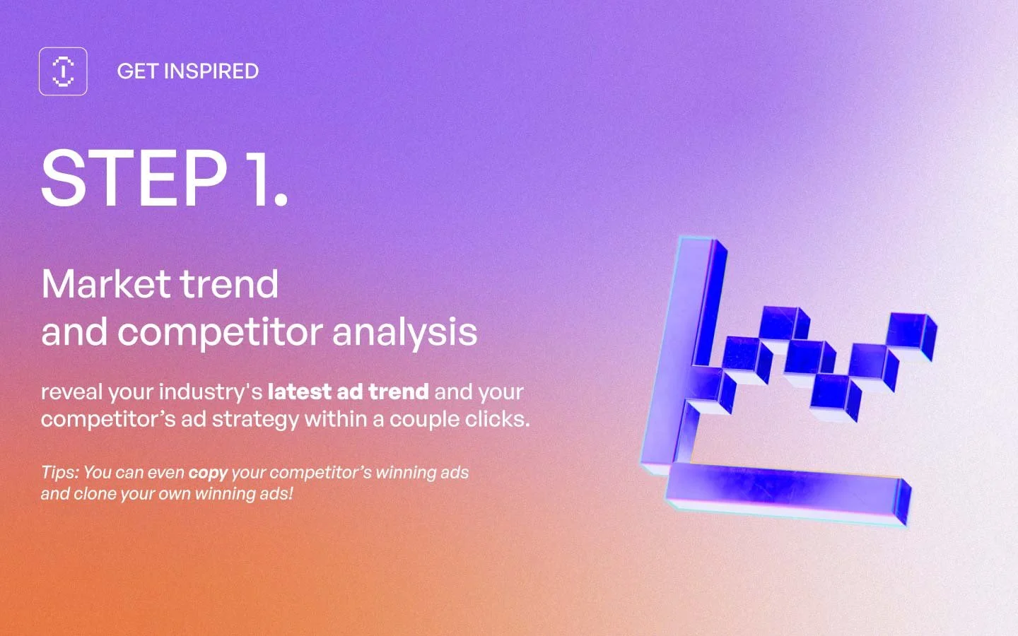
Step 1: Market Trend & Competitor Analysis – Inspiring insights with a “Get Inspired” CTA.
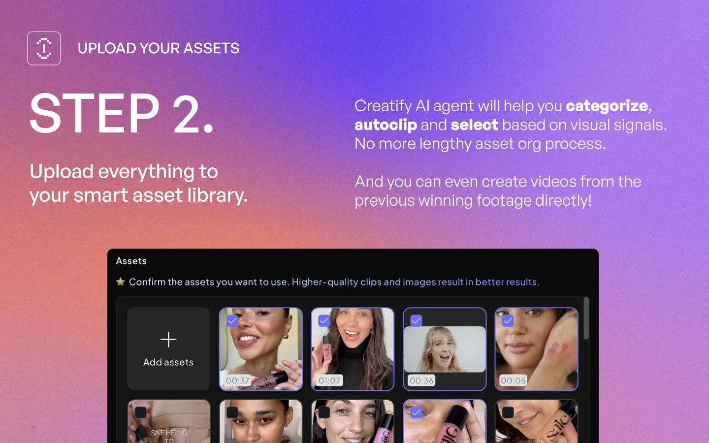
Step 2: Smart Asset Library – Clean visuals to reinforce automation and organization.
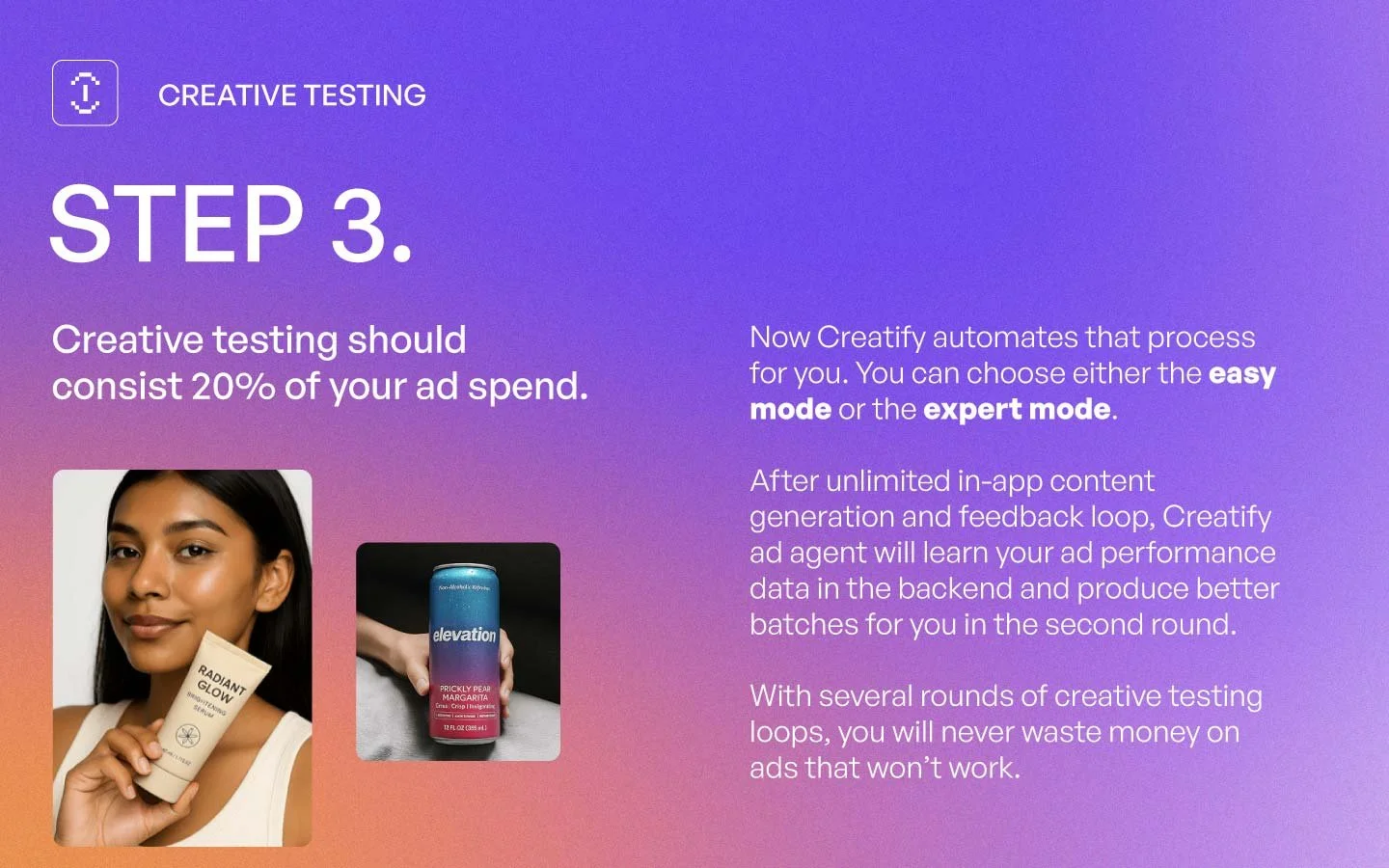
Step 3: Creative Testing – Showcased the iterative testing loop, making the process approachable.
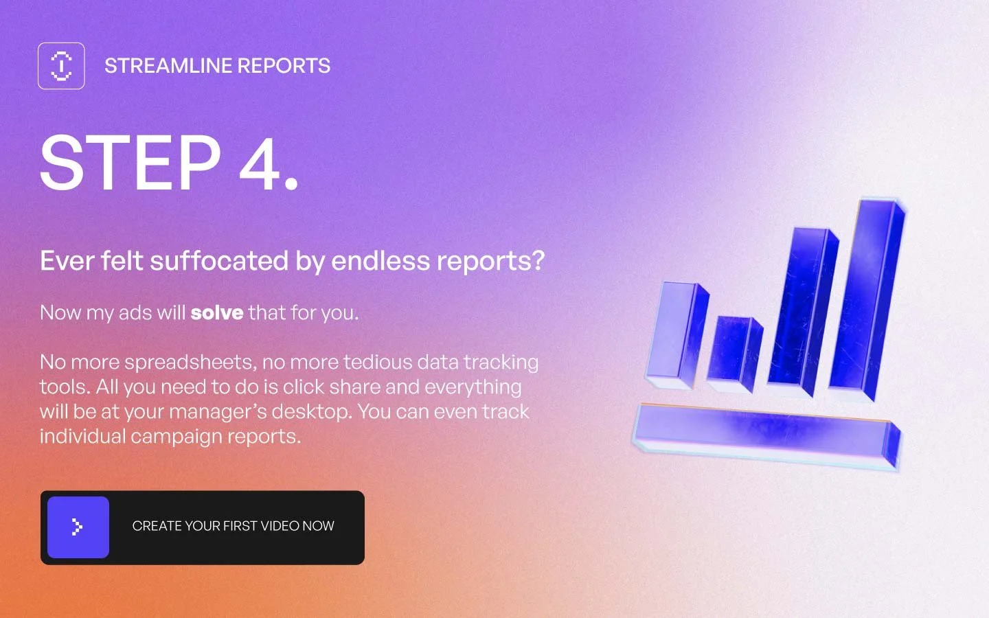
Step 4: Streamlined Reports – Illustrated simplicity by replacing complex spreadsheets with intuitive dashboards.
✦ Highlights
Balanced playful, modern design elements with structured clarity.
Communicated a complex process in a way that feels simple and digestible.
Ensured the thumbnail redesign was eye-catching while staying aligned with YouTube’s best practices for engagement.